Mobile product design
iOS and Android flows built around thumb reach, offline states, and permission moments that don't scare people off.
UI/UX design studio
Interface Atelier designs the layer where technology meets human intention. Every pixel, interaction and transition should feel inevitable — never accidental.
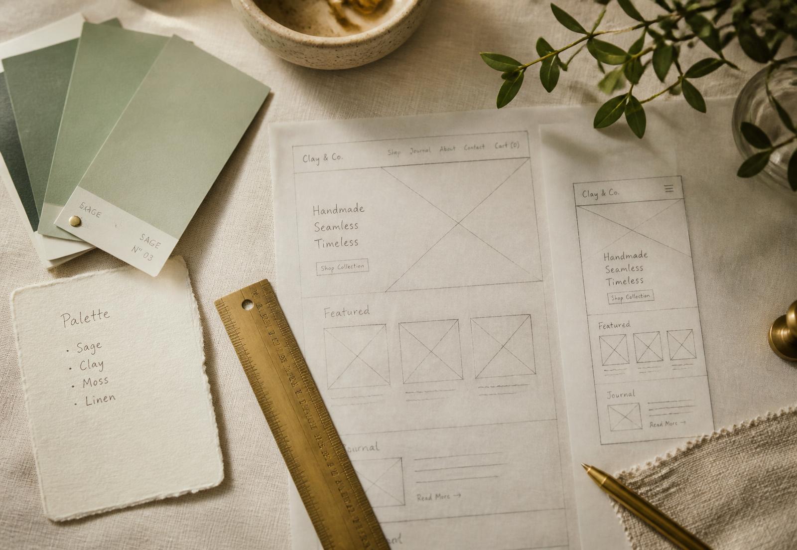
We are a small senior team. No account layer, no handoff telephone game — the people who research your users are the people who draw your screens.
Four stages, scrolled sideways — the way the work actually feels. Drag or swipe.
iOS and Android flows built around thumb reach, offline states, and permission moments that don't scare people off.
Design systems with real governance: tokens, variants, accessibility rules, and a changelog engineers actually read.
Glanceable cluster and center-stack interfaces designed to strict eyes-off-road budgets and cold-start legibility.
Dashboards, admin consoles and permission models that stay readable at ten thousand rows and three user roles.
WeChat and super-app experiences built inside platform constraints without looking like a compromise.
Transition choreography that explains state changes instead of decorating them. Every curve has a reason.
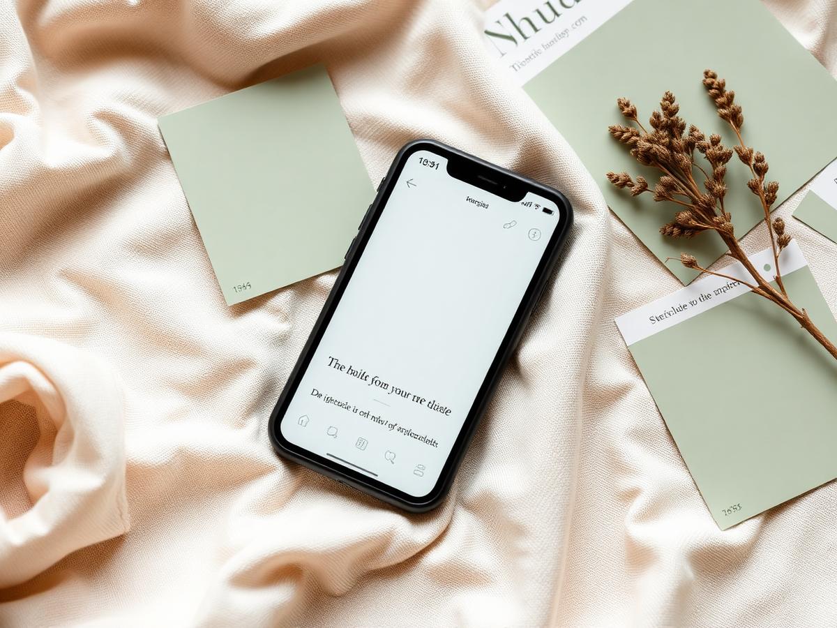
Rebuilt job intake for offline crews. Average dispatch time down from 4:10 to 2:35.

Charging and range UI tuned to a 1.6-second glance budget across three trim levels.
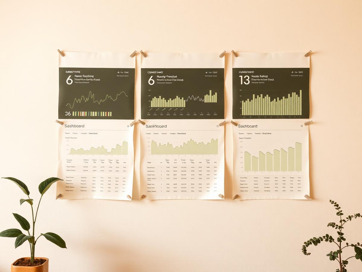
Role-aware dashboards for 12k-row tables; support tickets on reporting fell by half.

Onboarding that leaks, a settings page nobody can find, a cluster that fails the glance test. Send the problem and a screenshot; we reply within two business days with a first read and a scope sketch.
Contact the studio